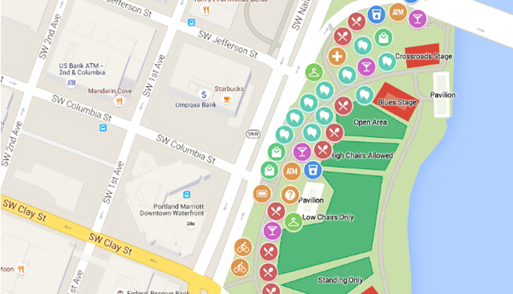
New Delhi: Millions of people depend on Google Maps to help them find their way through cities, across highways, and down backroads. Still, few users realise the subtle colour codes that elevate its maps above a simple, pretty interface. These colours are designed to communicate key information about roads, traffic, and terrain, and learning how to leverage this powerful yet deeply neglected tool can completely change how you travel.
Those road colours you see on Google Maps are not arbitrary. Different shades show different routes or route conditions, allowing the user to make instant decisions without scrolling through menus. Light grey lines mark local streets, perfect for neighbourhoods or short drives. The Moonstone blue colour accentuates highways and motorways, helping drivers to contribute to the best routes for long-distance travel. Railways or metro lines are represented using dark grey dashed lines, whilst dark grey solids can denote underground roads or tunnels. Dark green lines indicate protected bike paths, dotted green lines indicate bikeable roads and brown lines indicate unpaved trails (for cyclists).
Google Maps also features a colour-coded layer, activated by pressing a button, that reflects traffic conditions if traffic mode is turned on. Those green roads mean good going at speeds over 50 mph, yellow means moderate congestion with speeds between 25 and 50 mph, and red signals heavy traffic at speeds under 25 mph. Dark red is near-gridlock, which is usually caused by accidents or construction, while black can be where nobody is moving. Users cannot see these colours unless they activate the traffic layer; these colours are intended to assist drivers in avoiding delays.
Outside of roads, Google Maps shows colours over points of interest. Public services like hospitals or train stations are marked in pink, with lighter pink showing underground walkways, which is a godsend for some more congested cities like Tokyo. Cyan lines show drainage systems; dark tan shades indicate sandy beaches. Buildings are then colour-coded: light tan for commercial, for instance, grey for residential, and yellow for what we call “areas of interest,” where there is a high volume of users either eating, shopping, or drinking, based on user activity data.
Colour codes are helpful, but most people are unaware of them. In a 2023 thread on Reddit, some users expressed frustration at how they’d only found out how the system worked by looking through settings. One said, “I never knew pink meant hospitals until I got lost by one.” Update: The 2023 colour scheme, which replaced yellow highways with grey and green parks with a high-contrast blue, drew criticism for low contrast, helped bring road names to the forefront, and made blue pins for businesses stick out. Some liked the more modern look, while others deemed it “crayon scribbles”, proving how ignorant users were of the reasoning for the colour palette.
Users must enable layers such as traffic or biking through the menu in the map to unlock the full potential of this feature. Offline maps remember these colour codes to help travellers who find themselves in areas with little to no signal, as is often the case in rural areas. With the sprawling urban density of cities like the choking arteries of Delhi or the tech corridors of Bengaluru, Shri Guru Google Maps’ colours can serve hours of time and peace of mind. Next time you fire up the app, turn on the traffic layer or zoom in—those colours may lead you more than you realise.


Comments are closed.